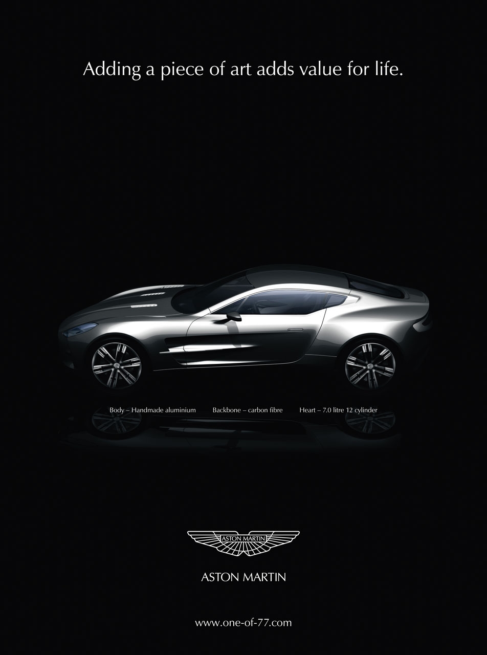
Aston Martin 2009 Ad
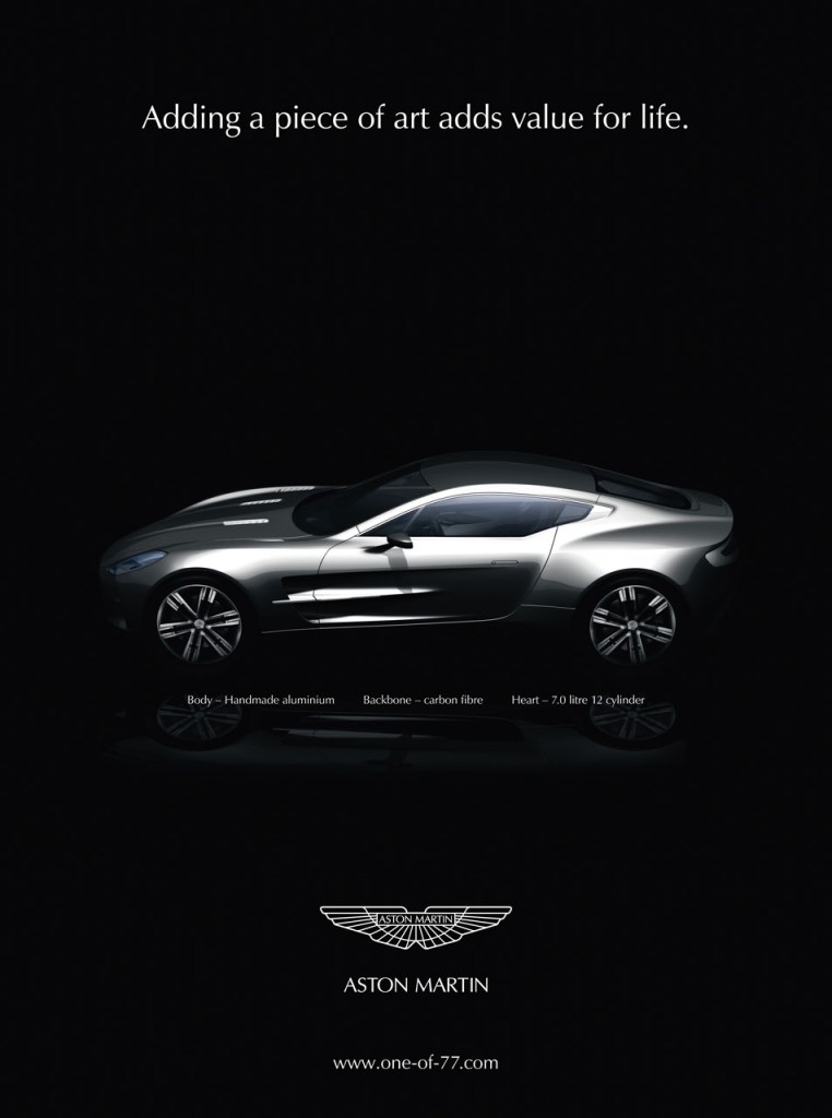
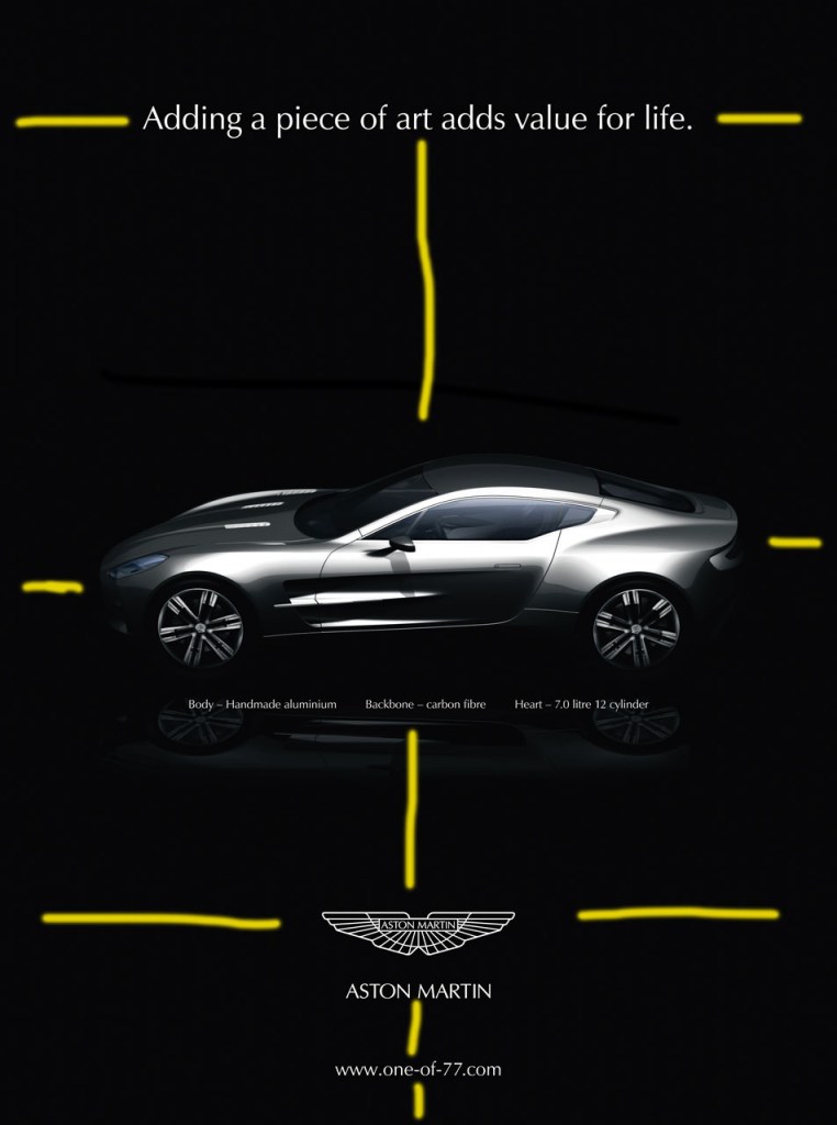
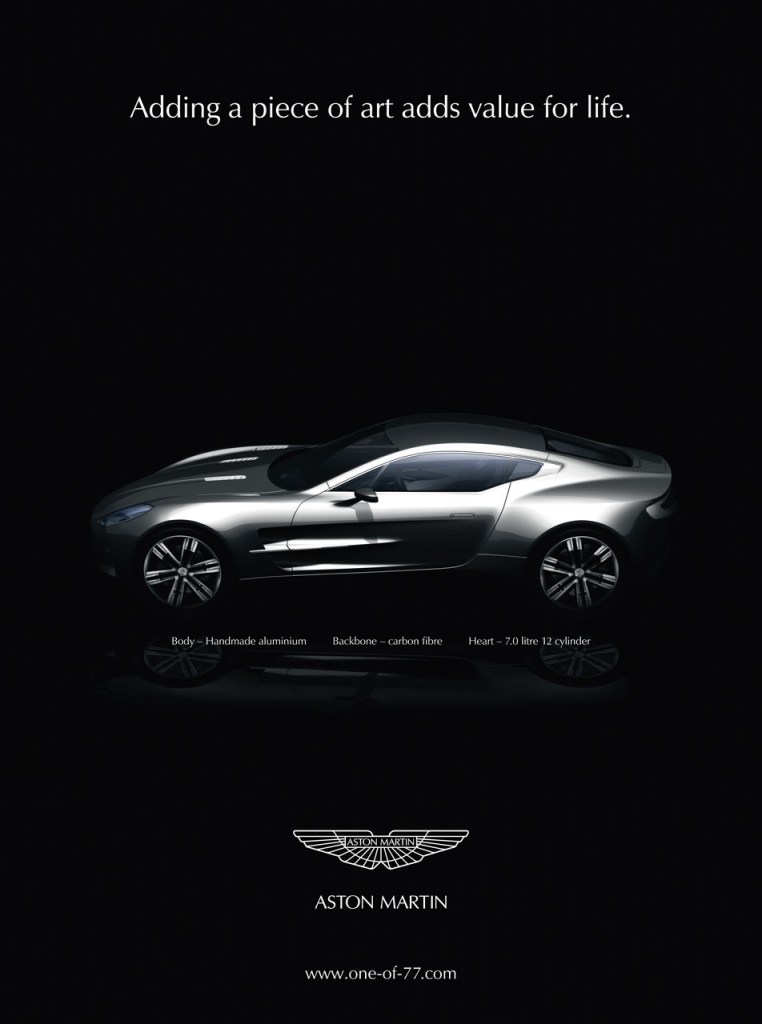
The ad above will be analyzed. It is an Aston Martin ad from 2009. I found this image on google images, and taken from a website called cartype.com. The link is, https://cartype.com/pics/5606/full/aston-martin_one-77_ad_08.jpeg
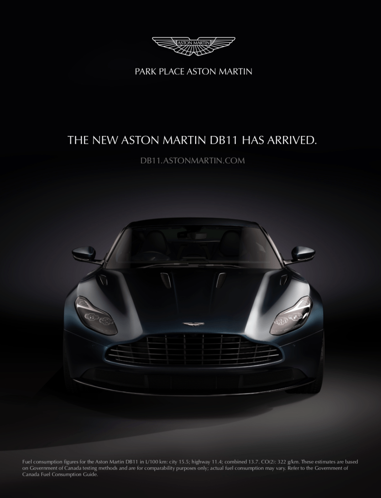
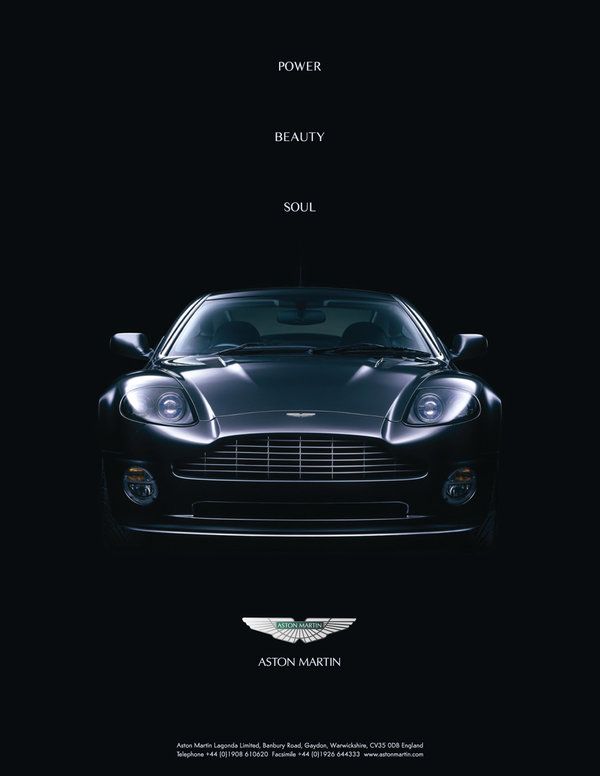
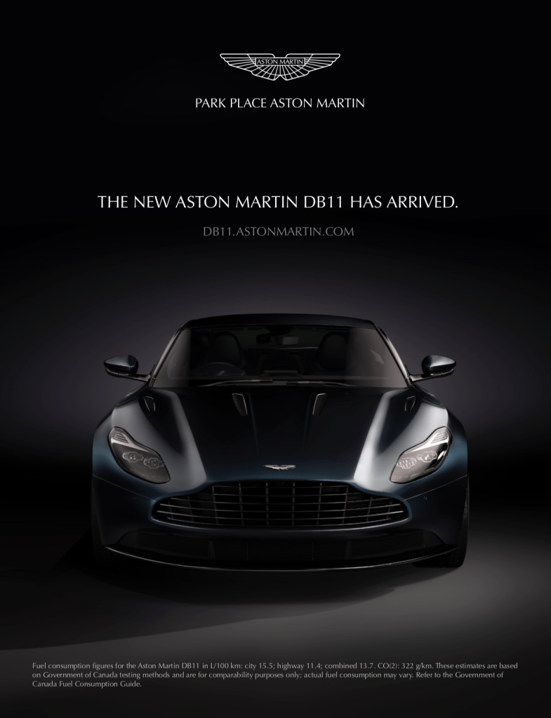
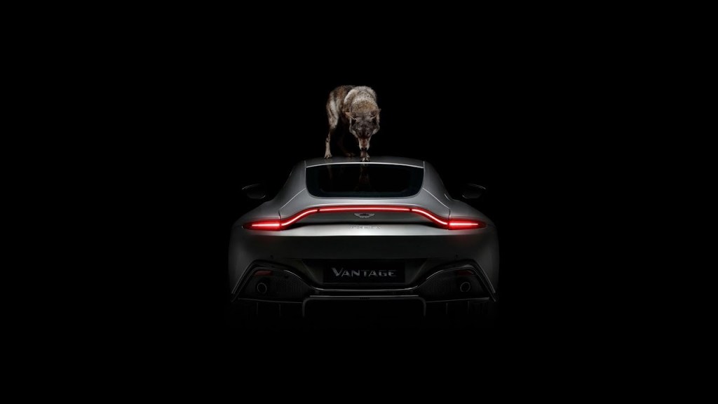
I could not identify the artist of this ad but I can deduce that this unidentified ad artist has designed multiple Aston Martin ads. Here are two more Aston Martin ads. These two ads are quite similar, especially in color:
Contrast
The most obvious contrasts are the text, the car, and the black background.

It appears to have the basic black and white contrast to make the text, the car, and the logo ‘pop out’ a little more. It is easier to look at and easier to see all the information provided in the ad.
Proximity
The proximity of the texts and images are aligned in the center. There are just three simple blocks making it easier to go in order, keep track, and to see. Everything is spaced far enough, and not too close to be able to be pleasing to the eye.
Repetition
The most obvious repetition we can see are the colors. The white/grey of the text and images are quite easy to notice in comparison with the black background. There isn’t a whole of information in terms of text. This limited text information makes it easy to glance over and read what it’s about. Even with the other two ads, there is a limited amount of text, keeping the ads very consistent.
Alignment
The texts and images are aligned in the center, bringing your attention to the center; you focus on the car at first. The writing is small; your focus stays on the car, pulling you in.
Color
This could be one of the most simplest, if not the simplest ad created. As mentioned already, this is a black and white comparison, with shades of grey for the car. This is quite consistent with the other Aston Martin ads, making their ads likable and easy to read.
 Adam's blog
